
Why One McDonald’s Has Turquoise Arches: The Sedona Story
Most people instantly recognize the iconic golden arches of McDonald’s, a symbol of fast food worldwide. However, there is a unique exception: a McDonald’s in Sedona, Arizona, where the arches are turquoise instead of gold. This unusual color choice has a fascinating story rooted in local regulations, aesthetics, and environmental awareness.
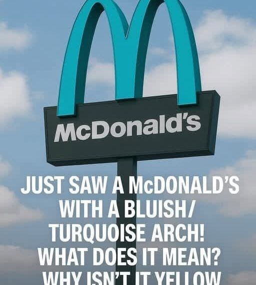
The Sedona Location
Sedona is famous for its stunning red rock landscapes and natural beauty. The city enforces strict building codes and aesthetic regulations to preserve the scenic environment. When McDonald’s planned to open a restaurant there in 1993, city officials worried that the bright yellow arches would clash with the natural surroundings.
Why Turquoise?
To comply with local ordinances, McDonald’s chose turquoise (teal) arches, a color that blends with Sedona’s desert and rock formations. This decision is a rare example of a global brand adapting to local cultural and environmental standards. The restaurant itself functions like any other McDonald’s, but its visual identity stands out as a local landmark and tourist attraction.
Impact
The turquoise arches have become a symbol of balance between corporate branding and environmental preservation. Visitors often photograph the unique arches and share them on social media, making this McDonald’s one of the most recognizable yet unconventional locations worldwide.
Other Variations
While Sedona’s turquoise arches are unique, there are other McDonald’s locations worldwide with different-colored signage, such as white, black, or muted tones, to blend with local architecture or historical districts, showing the brand’s flexibility and respect for community aesthetics.
Conclusion
The turquoise arches in Sedona represent more than a design choice—they reflect thoughtful integration of global branding with local landscape preservation. Even iconic symbols can evolve to respect their surroundings without losing their identity.